Process
RESEARCH
I interviewed Tim to complete a creative brief and understand his industry and unique value proposition. My branding goal was to create a DBA trademark that communicates residential and marine property management services that are professional, dependable, and highly personalized.
EXPLORATION
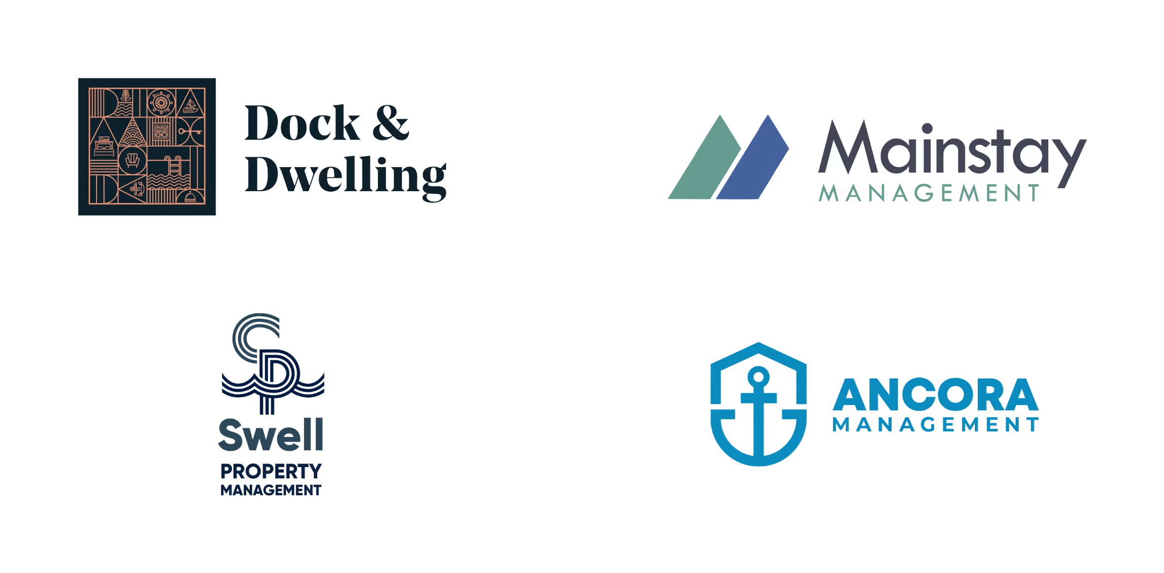
I brainstormed naming ideas and logotype concepts based on representing personal home and boat care. The result were six trademarks in different styles ranging from upscale art deco, approachable tongue-in-cheek humor, and tech inspired simplicity. Each version employed colors related to its main values.
FINAL TRADEMARK
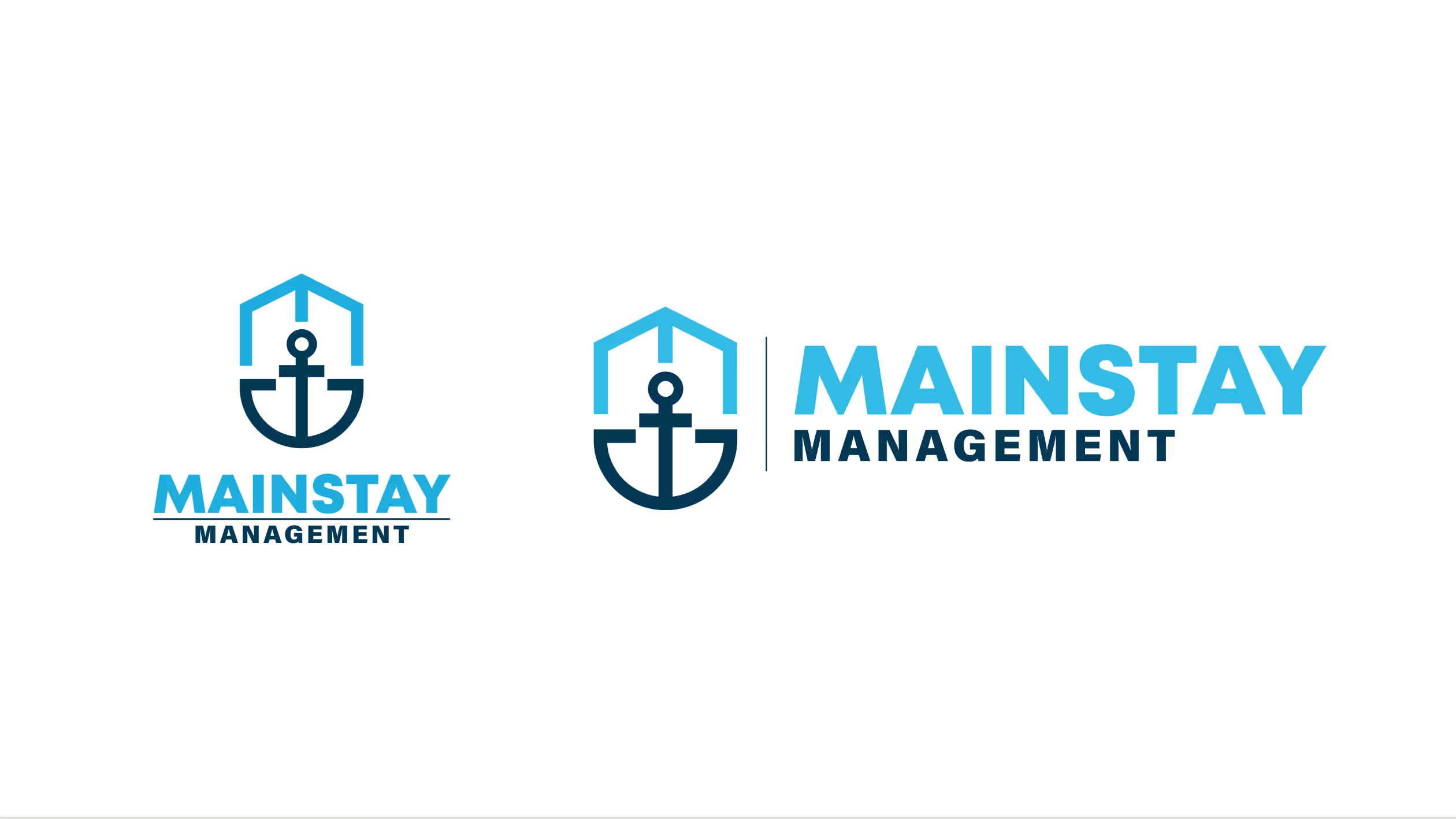
The Mainstay name combined with the roof and anchor emblem won in the end as an identity that symbolizes a true second home that is something more than a vacation getaway. The subtle inclusion of the letter “M” at the top of the symbol indicates attention to detail.
COLOR & TYPE
Tech-inspired shades of blue signal trustworthy services and customization. The logo, links, and paragraph text is sans-serif while headlines are serif. The combination is meant to appeal to the target customer’s association of serif fonts with upscale financial services.
UI DESIGN & ICONOGRAPHY
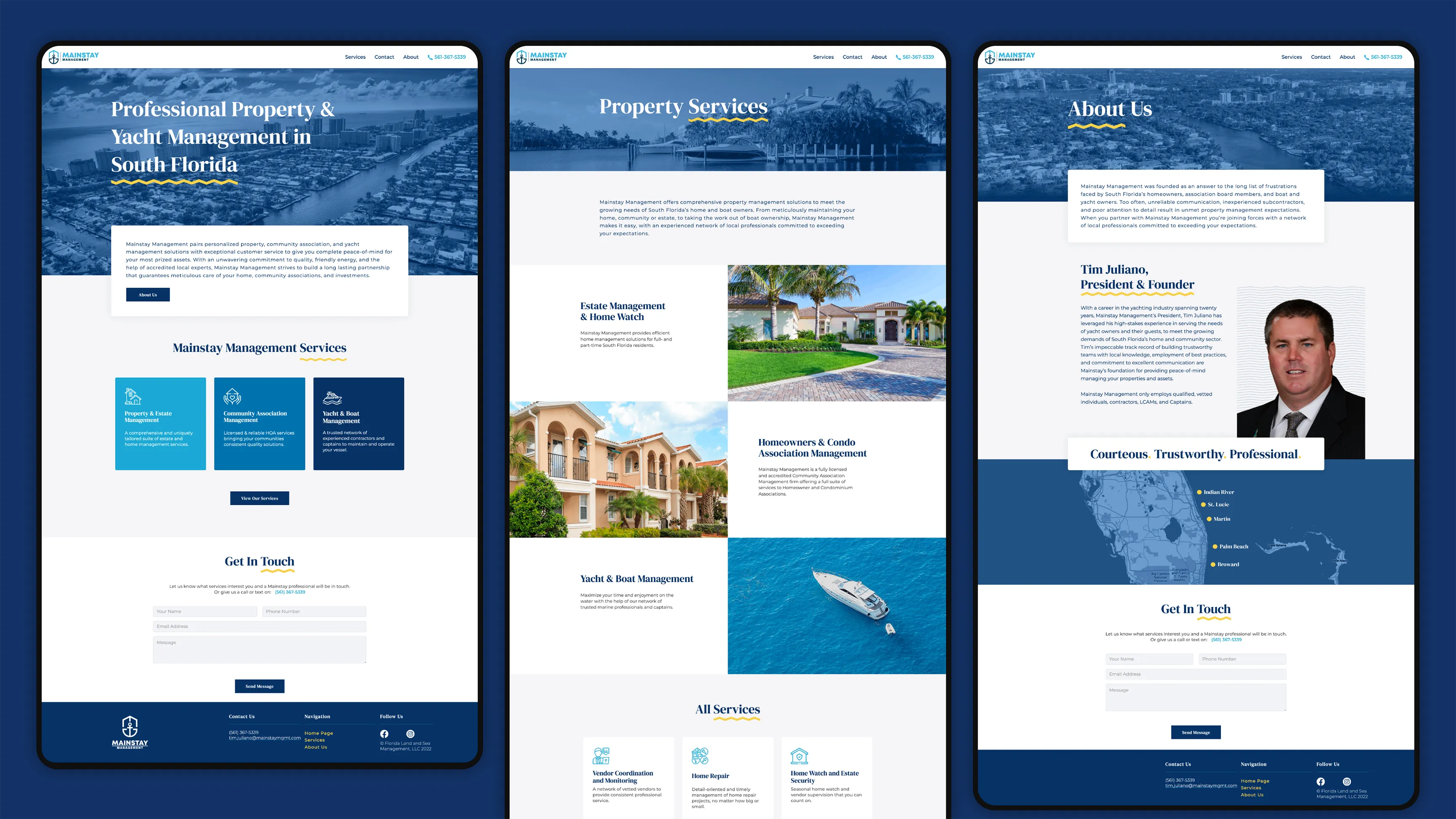
The final website prioritizes Mainstay’s big picture on the first page with services elaborated on the second. The phone number dial link as well as the Contact anchor link make it easy to reach Tim. On the service page, each Mainstay offering is described in a responsive, card-style list with appropriate iconography.
Brand Guide
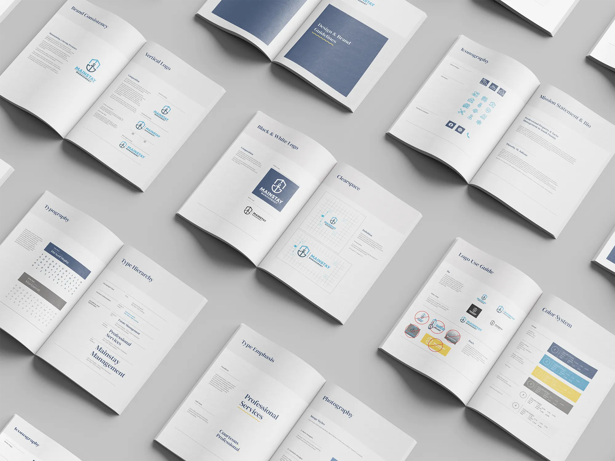
With final website designs approved, I created a brand style guide to help Tim in every marketing endeavor that he has. I included different types of horizontal and vertical logo lockups in color as well as black and white. Additionally, I added instructions on type hierarchy, photography treatment and iconography.
Collateral
The final deliverables in this project included a postcard, stationery, and a folder design for Mainstay.